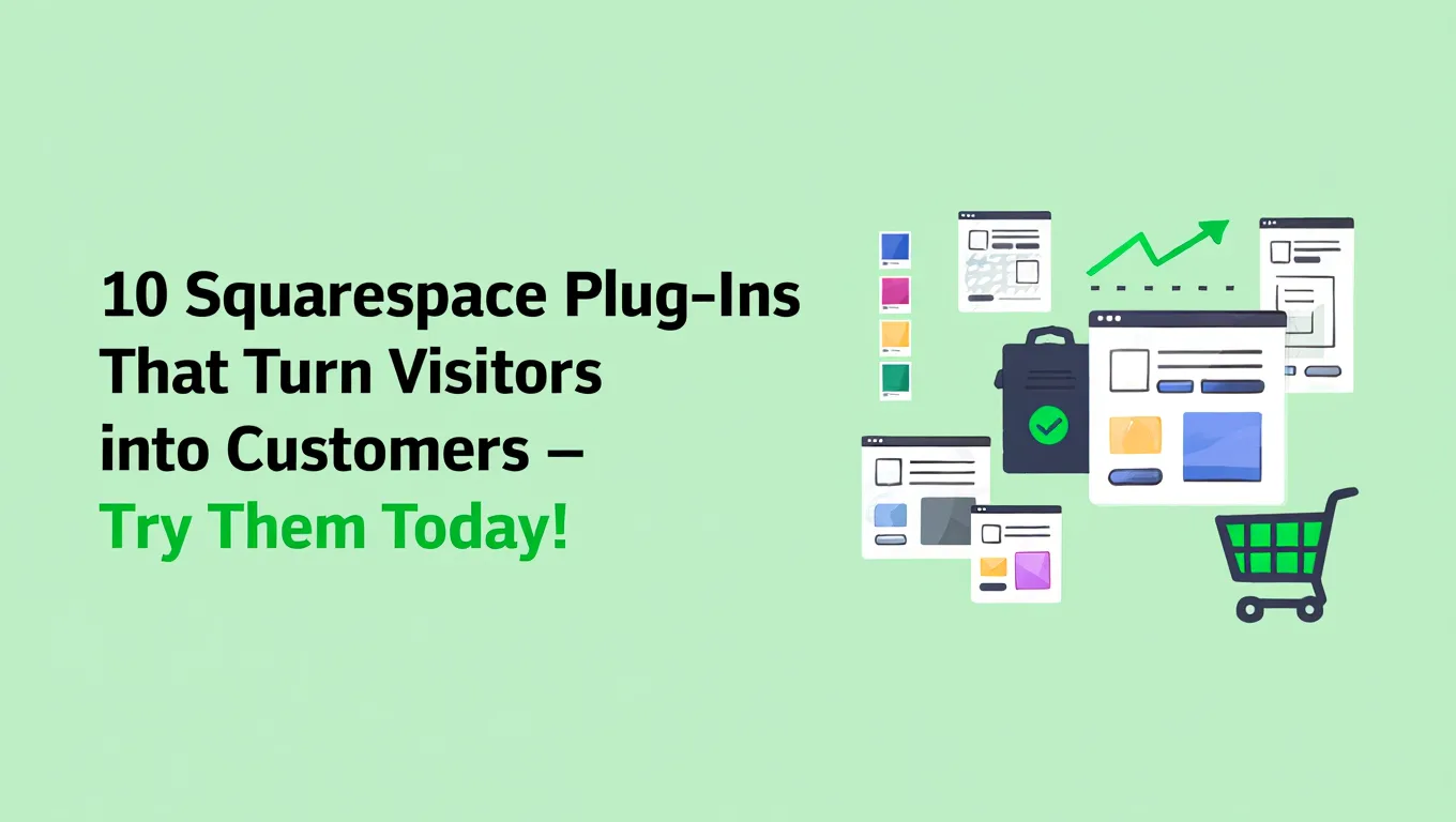
10 Squarespace Plug-Ins That Turn Visitors into Customers – Try Them Today!
When a person visits your site, it indicates that he or she is somehow attracted to your offer. The traffic to your site is driven by different reasons, like curiosity, etc. Besides, at that moment your site becomes a living entity rather than just a pile of digital pages.
Many websites look good and are built with care, yet still struggle to turn visitors into customers. The reason is rarely about design quality or effort.
More often, the experience simply asks a little too much from the visitor. They may need reassurance, clearer guidance or a simpler next step. When those elements are missing, people pause, reflect and move on without realizing why.
Studies have shown that even the smallest page load delays lead to major increases in bounce rates. But conversion goes beyond performance metrics. Human beings naturally respond to situations that provide clear information and create a sense of comfort.
This is where the right Squarespace plug-ins quietly make a difference. They help structure attention, reduce mental load and guide visitors forward in a way that feels natural.
Here are 10 Squarespace-compatible plug-ins that can help you convert maximum visitors into customers:
1. SquareKicker
Most visitors don’t leave because they aren’t interested. They leave because they’re unsure. SquareKicker turns uncertainty into interaction by allowing visitors to engage with calculators, quizzes and estimators that respond to their inputs instead of asking them to read long explanations.
SquareKicker is especially powerful for service-based businesses. Coaches, consultants, agencies, educators and wellness practitioners can all use it to help visitors understand value before committing. Rather than telling someone “Our services start from X”, you let them explore what it means for them. That shift changes the emotional tone of the decision.
Benefits
- Creates interactive calculators, quizzes and estimators
- Increases time spent on key pages
- Helps visitors self-qualify before reaching out
- Reduces price-related hesitation
- Improves lead quality
How to use it
Add a pricing estimator, service selector or “Is this right for you?” quiz on high-intent pages. Interactivity replaces over-explaining and leads visitors gently toward clarity.
2. Elfsight Popup
Popups often fail because they appear too early and demand attention before trust is built. Elfsight changes that by triggering popups based on behavior, not impatience, allowing visitors to first understand your message before being asked to respond.
When popups appear at the right moment, they feel helpful rather than annoying. A gentle reminder or offer after engagement feels like guidance. That subtle shift reduces resistance, increases signups and keeps visitors feeling respected instead of interrupted.
Benefits
- Exit-intent and scroll-based triggers
- Clean, customizable designs
- Mobile-friendly behavior
- Improves email capture without annoyance
- Reduces bounce rates
How to use it
Avoid instant popups. Trigger them after engagement, 40% scroll, time on page or exit intent. Timing builds trust more than copy ever will.
3. MemberSpace
Giving everything away upfront often lowers perceived value. MemberSpace helps you place intentional boundaries around your most useful content, making access feel earned rather than assumed. This changes how visitors relate to your expertise from casual browsing to meaningful engagement.
When people exchange an email or payment for access, they commit mentally. That commitment deepens trust. Instead of consuming passively, they lean in. This shift often leads to stronger leads, higher retention and more serious conversations. MemberSpace is ideal if you offer knowledge, guidance, programs or resources. It works quietly in the background while keeping your Squarespace design intact.
Benefits
- Locks premium content without coding
- Supports subscriptions and one-time access
- Builds a high-intent email list
- Increases perceived expertise
- Integrates smoothly with Squarespace
How to use it
Gate your most helpful resources, guides, workshops, videos, templates. Don’t hide everything. Hide what matters most.
4. Tockify
Many visitors want to book but pause because the process feels unclear. Tockify removes that pause by making availability visible and booking immediate. No emails. No waiting. Just a clear next step that feels easy to follow.
When scheduling is simple, people act while interest is fresh. The fewer steps between intent and action, the higher the conversion. Visitors don’t overthink. They choose a time, commit and move forward without second-guessing. Tockify is especially effective for consultants, therapists, educators and service providers who rely on calls or sessions.
Benefits
- Visual calendars and bookings
- Reduces back-and-forth emails
- Improves booking confidence
- Works well on mobile
- Supports events and sessions
How to use it
Place booking calendars immediately after explaining your service. Don’t make people search for how to take the next step.
5. POWR Forms
Long, overwhelming forms silently kill conversions. POWR Forms improves this by breaking forms into clean, logical steps that feel manageable. Visitors focus on one question at a time instead of facing a wall of fields.
When effort feels low, completion rates rise. Conditional logic ensures visitors only see what’s relevant to them. This reduces frustration and makes the form feel personal, respectful and worth completing instead of something to postpone or abandon. Forms are often the final emotional hurdle. POWR helps make that hurdle feel small.
Benefits
- Multi-step and conditional forms
- Clean, responsive design
- File uploads and payments
- Integrates with email tools
- Reduces form abandonment
How to use it
Break long forms into steps. Ask only what you truly need. Completion comes from clarity, not thoroughness.
6. Ghost Plugins
Visitors look for reassurance before they commit. Ghost Plugins adds subtle social proof that shows real activity without cluttering the page. Instead of loud testimonials, it quietly confirms that others trust and choose you.
This quiet validation reduces doubt. People feel safer knowing they’re not alone in their decision. When social proof feels organic, it builds confidence without pressure, making it easier for visitors to take the next step naturally. It works especially well when visitors are already interested but hesitant.
Benefits
- Subtle activity notifications
- Review and trust widgets
- Minimal visual disruption
- Improves credibility
- Reduces hesitation
How to use it
Place social proof near CTAs, not hidden on separate testimonial pages.
7. Finsweet Attributes
Finsweet Attributes plays a significant role in sorting out the website contents so the visitors can easily and quickly filter and find what is most interesting and relevant to them. The site proves to be supportive instead of frustrating when users find their needs easily.
Crisp navigation instills trust. Customers feel reciprocated, not abandoned. This feeling of helpfulness often results in quick decisions, extended involvement and decreased departures since the users remain when they sense that the experience is tailored for them. This phenomenon is particularly pronounced in the case of content-heavy or service-abundant websites.
Benefits
- Dynamic filtering and sorting
- Cleaner user journeys
- Reduces overwhelm
- Improves content discoverability
- Keeps layouts intact
How to use it
Filter services, blogs or portfolios by need, category or intent. Let visitors guide themselves.
8. Mailchimp
Most visitors aren’t ready to act immediately. Mailchimp helps you stay connected without pressure by capturing emails and nurturing relationships over time. It turns one-time visits into ongoing conversations.
When follow-ups are thoughtful and relevant, trust grows slowly but steadily. Email gives visitors space to decide at their own pace. That patience often leads to higher-quality conversions rather than rushed or regretful decisions. Mailchimp works best when email feels like value, not noise.
Benefits
- Automated email journeys
- Audience segmentation
- Abandoned form recovery
- Long-term conversion growth
- Easy Squarespace integration
How to use it
Offer something genuinely helpful. Education converts better than promotion.
9. Hotjar
Guessing why visitors don’t convert leads to wrong fixes. Hotjar shows how people actually behave, where they pause, scroll, hesitate or leave. This visibility replaces assumptions with real understanding.
When you see friction clearly, improvements become obvious. Small changes based on behavior often outperform big redesigns. Understanding users at this level helps remove silent blockers that words and analytics alone can’t reveal. Hotjar doesn’t just show data. It shows intent.
Benefits
- Heatmaps and recordings
- Scroll and click behavior
- Identifies friction points
- Improves UX decisions
- Reduces guesswork
How to use it
Fix what people ignore before adding more content. Removal often converts better than addition.
10. Stripe Checkout
The final step matters the most. Stripe Checkout reduces hesitation by using a payment experience people already recognize and trust. Familiar flows remove fear at the moment when commitment is highest.
When payment feels smooth and secure, visitors don’t second-guess. Trust at checkout protects all the effort that came before it. A calm, reliable payment experience often becomes the final nudge from interest to conversion. Payment friction kills momentum. Stripe preserves it.
Benefits
- Fast, secure checkout
- Mobile-optimized flows
- Global payment support
- Reduces abandonment
- Builds payment trust
How to use it
Place checkout immediately after decision points. Don’t let momentum cool.
Bonus Insight: Conversion Is Emotional Before It’s Technical
People don’t convert because your website looks good. They convert because it feels easy!
Easy to understand.
Easy to trust.
Easy to move forward.
Plug-ins don’t manipulate people. They remove friction from human decision-making.
Conclusion
A website that converts well often feels almost invisible. Visitors move through it smoothly, understand what is being offered and sense exactly what to do next without effort. Nothing feels rushed, heavy or confusing. The experience simply flows.
The Squarespace plug-ins covered in this article support that flow. Each one addresses a specific moment where visitors usually seek clarity, reassurance or direction. Some help people understand value, others simplify action and a few quietly build trust. Together, they strengthen the overall experience rather than overpower it.
FAQ’s
Some improvements, like better pop-up timing or clearer booking visibility, can show measurable results within weeks.
Plug-ins that improve timing, clarity, and engagement tend to reduce bounce rates quickly. Tools like behavior-based popups (such as Elfsight), interactive calculators (SquareKicker), and heatmap analysis (Hotjar) directly address hesitation points. Instead of redesigning your entire website, these tools remove friction at key moments. Small improvements like better CTA placement, scroll-triggered offers, or clearer navigation can significantly lower bounce rates without increasing content volume.
Popups are effective when triggered intelligently. Instant popups often cause frustration, but scroll-based or exit-intent popups can increase email capture without damaging user experience. Timing and relevance matter more than design alone. When popups feel helpful rather than intrusive, they convert well even today.
Track metrics before and after installation. Monitor bounce rate, time on page, form completion rate, booking conversions, and checkout abandonment. Tools like heat maps and analytics dashboards help you see behavioral changes. Real improvement shows in smoother journeys and fewer drop-offs, not just increased traffic.
It depends on buying intent. If visitors need nurturing, prioritize email capture. If intent is high, simplify checkout instead.